College of Arts, Humanities, and Social Sciences - Van Wraps
The College of Arts, Humanities, and Social Sciences at UMBC requested for a design that would treat their vans as rolling billboards to aid with visibility and recruitment. Some of the key terms that were brought up during the kick-off meeting were “energetic, vibrant, sophistication, and unity.” Since there’s a current service called UMBC Transit which provides transportation services for commuting students at UMBC, it was voiced that they wanted a design for CAHSS that was different than the designs that were currently on the buses.
Jim Lord, the AVP in Brand and Creative Strategy of University Communications and Marketing at UMBC, brought in the idea of using the designers on the team to showcase how we all would approach the task then present them to the client. As you can see below, I built multiple ideas. After continuous feedback from the CAHSS Dean and Director of Operations, we proudly were able to produce the final results.

Whenever I’m assigned a design task, I like to provide three versions for the client/partner to choose from. From the three, there’s always a “within brand” option, a wild card and a hybrid of the two.


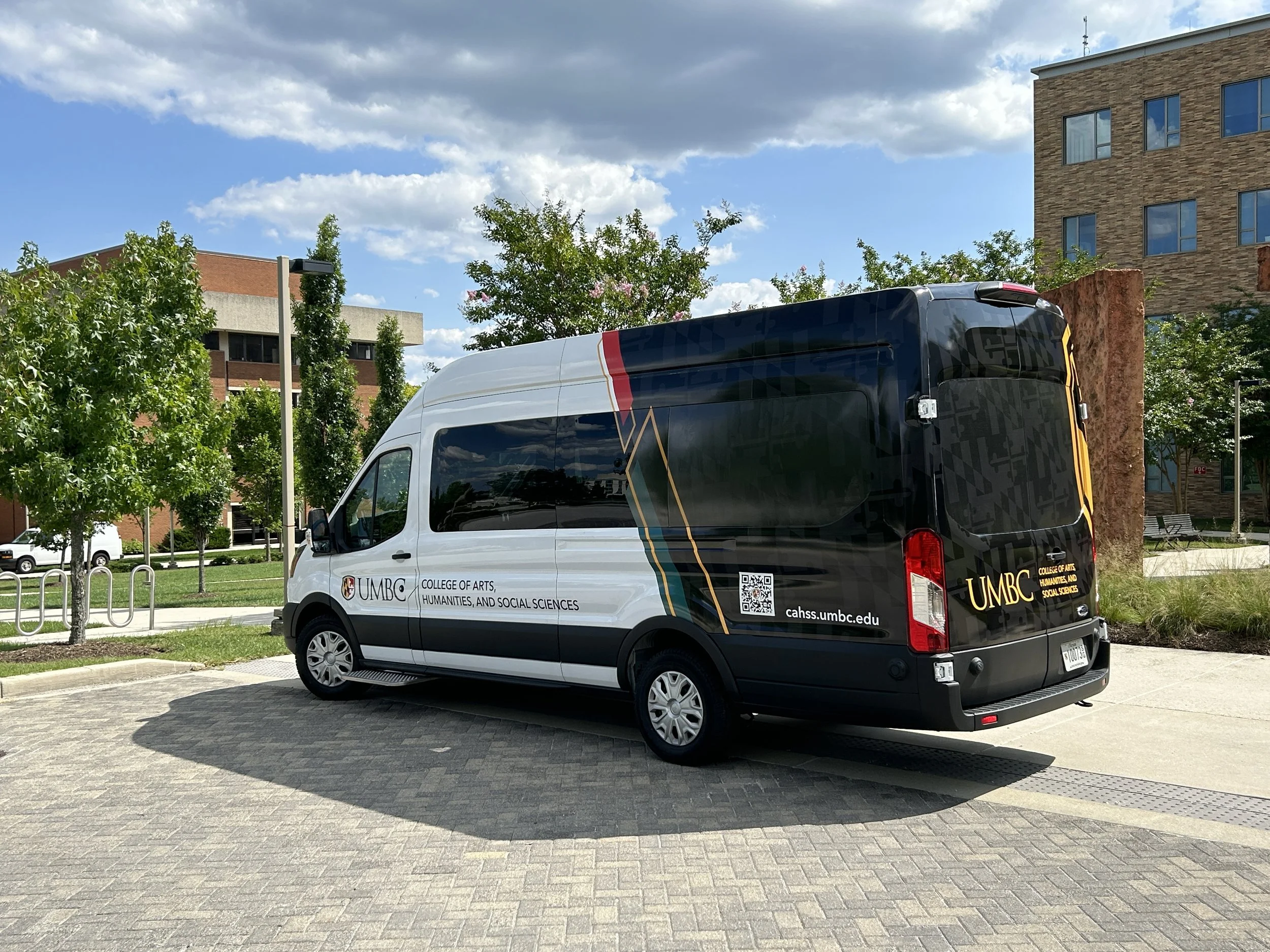


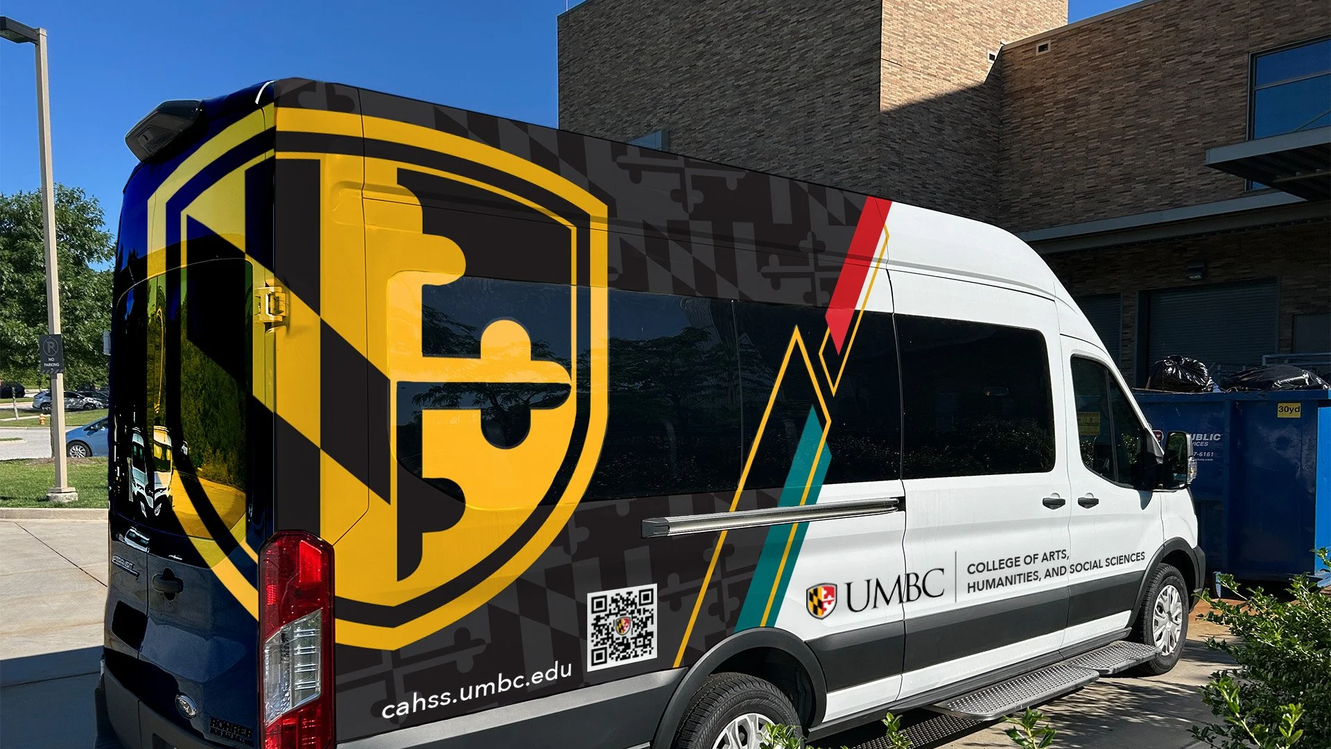
Concept 3 became the leading option, however, I was asked to push forward with just using the university shield graphic, CAHSS logo, URL and QR code. So when I received that feedback from our VP at the time, they wanted to focus on the university as the primary attention, followed by the CAHSS CTA. Therefore I focused on our mark (shield) and the supporting graphics within branding that were used in a unique, inspiring way that did a fantastic work of representing our campus and the college on the vehicles, creating that unison and sophistication.
Concept 1:
With this approach, I focused on dynamic shapes in a creative pattern that brought visual attraction but also calling out certain programs within the college. The colors primarily are black and gold, but with more emphasis on the secondary color pallet of the university. The QR code is set for the back, along with the URL for safety reasons (as it was important for the client that there were a QR code on the van.) We want to keep in mind that not everyone’s phone is capable of scanning a QR code or know how to do so, so for best practice, we always include the URL so that they can quickly take a picture and have that information. The various shapes help guide the eyes to the programs, which in return, leads the viewer to seeing and reading more.
Concept 2:
As you can see, this is a creative way to draw interest of the viewer, grabbing their attention to see what the call to action is. Again, the QR code and URL are on the back, along with the college’s logo but this design hit all the points except for sophistication and unity, for the college and it’s programs.
Concept 3:
This concept was the “with-in” brand example. Now, given how much you can design with just black and gold, and the many, many approaches one can build out, this one does a great job combining many visual graphics/elements we’ve used throughout all our creative designs with a fresh take. The secondary colors compliment the primary; the diagonal lines and shapes that are used in UMBC branding fits well with displaying the 4 areas of CAHSS (especially with the use of icons representing them), and it’s simplified but effective for someone seeing the rolling build-board. We centered the college’s logo, bringing emphasis to them and what programs support into who they are.