Mrs Eaves Type Specimen Book
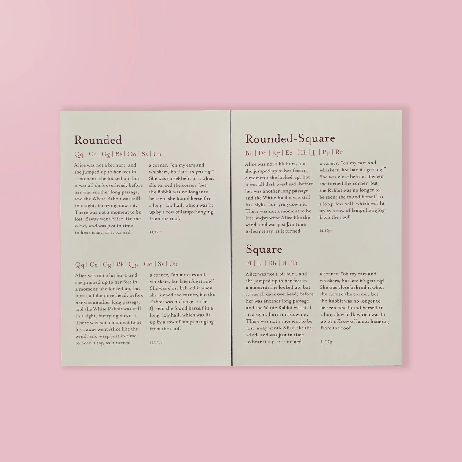
For this project, I explored the intersection of typography, and visual language by designing eight original glyph pairs that work with Zuzana Licko’s Mrs Eaves typeface—each consisting of an uppercase and lowercase form—to represent sounds that currently have no dedicated written symbols. The glyphs were designed to seamlessly integrate into an existing typeface alphabet, which I studied and analyzed as part of a supporting research paper (Monograph).
Drawing on principles of typographic consistency and formal nuance, I created glyphs that align with the visual language and structural logic of the selected typeface. The project responds to the evolving nature of language and how cultural, technological, and contextual shifts influence the shapes of the symbols we use to communicate. My approach emphasized precision, legibility, and typographic cohesion, recognizing that a glyph’s success is measured by how naturally it fits within its type family.
This monograph showcases my ability to combine linguistic research with type design, while demonstrating a deep understanding of typographic anatomy, form-making, and the relationship between glyph design and visual representation. InDesign and Glyphs was used to produce this.